
統計
數字顯示了什麼?運用附標籤的重點標示與清楚摘要,凸顯幾項重要數據。
試試看 統計 版面配置一個構想,更清楚的全貌。
以視覺形式呈現事實、步驟與故事。
將筆記與資料製成適合報告、課程、簡報及社群貼文的資訊圖表。說明重點,再透過聊天微調設計。
從想述說的故事開始
最清楚的版面取決於內容。先確定你需要回答的問題。
運用附標籤的重點標示與清楚摘要,凸顯幾項重要數據。
試試看 統計 版面配置每個選項使用相同類別,讓讀者能以一致基準進行比較。
試試看 比較 版面配置將工作流程或一組指示轉化為具備清楚步驟與標籤的順序圖。
試試看 處理 版面配置將日期、里程碑及專案或公司故事整理成容易理解的順序。
試試看 時間軸 版面配置將技巧、習慣或檢查清單整理成簡短要點,並維持一致的視覺節奏。
試試看 清單 版面配置以精簡區塊、附標籤的插圖或簡單的視覺循環說明概念。
試試看 資訊型 版面配置提供內容,塑造設計。
為設計設定明確目的,並將資訊量控制在適當範圍。
描述主題與受眾,再貼上要納入的事實、數據、步驟或日期。為資訊圖表設定一項主要結論,並提供需要顯示的資料來源。
可要求製作統計摘要、比較表、流程圖、時間軸、清單或解說圖。請描述色彩、風格與版面,並說明資訊圖表的使用情境。
先產生第一版設計,再透過聊天要求更清楚的標題、更精簡的文案或不同的視覺順序。下載圖片前,請檢查文字、數字與圖表標籤。
報告與資料故事
協助讀者掌握調查或業務近況中的重點。提供實際數值、單位與期間,再挑選幾項最能說明脈絡的數據。使用簡短標題與重點結論,讓資訊圖表成為完整報告的輔助內容。
試試這個方向根據以下虛構的工作坊調查結果製作直式資訊圖表:共 80 份回覆,60 人偏好實作課程,20 人偏好講座。使用兩個附標籤的長條,並以「多實作,少講授」作為重點結論。註明資料僅供示意,且只能使用所提供的數值。建立資訊圖表
流程與團隊溝通
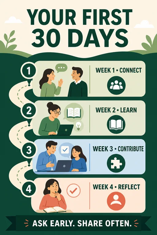
將冗長的連續指示改為清楚的視覺路徑。使用你的實際步驟、保持標籤簡潔,並清楚標示起點與終點。流程資訊圖表很適合用於新人導入、專案交接、培訓及需要反覆分享的說明。
試試這個方向製作包含四個階段的新人到職資訊圖表:認識團隊、熟悉工具、嘗試第一項任務、共同檢討。每個階段使用一個圖示與一則簡短標籤,採用由上而下的清楚路徑,以及親切的藍綠配色。建立資訊圖表
比較與決策
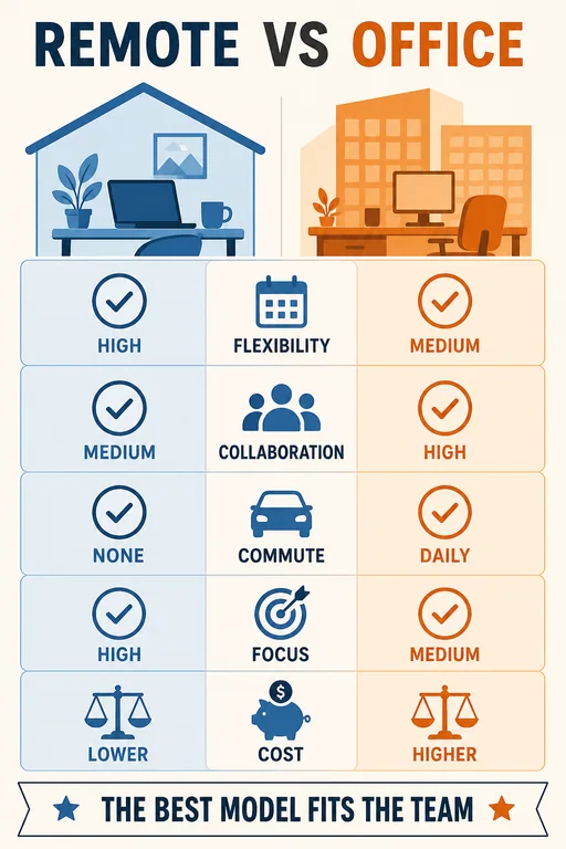
以一組共通問題說明選擇。將各選項並排,並提供每個類別的文字,避免使用冗長段落。若想呈現取捨而不判定優劣,可要求各選項具備相同的視覺權重。
試試這個方向為兩種工作坊形式製作比較資訊圖表。線上:遠端參加、數位練習、無須交通往返。實體:共用空間、實體練習、需要交通往返。使用鏡像排列的列、給予相同強調程度,且不得捏造評分或統計資料。建立資訊圖表
找到視覺起點
探索行銷、團隊工作流程、比較、教育等用途的版面。這些 AI 產生的範例包含示意用的範例資料;選擇一款以開啟其提示詞,再加入自己的內容。
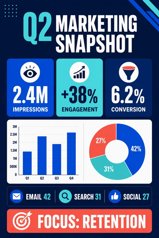
A bold business snapshot with KPI cards, a channel bar chart, and a concise performance takeaway.
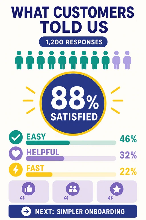
使用這個構想A friendly survey summary using a large satisfaction score, response breakdown, and key themes.
使用這個構想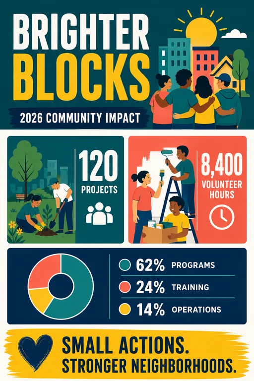
A human-centered annual impact infographic with bold outcomes and a transparent allocation chart.
使用這個構想A balanced side-by-side comparison with mirrored categories and a neutral decision takeaway.
使用這個構想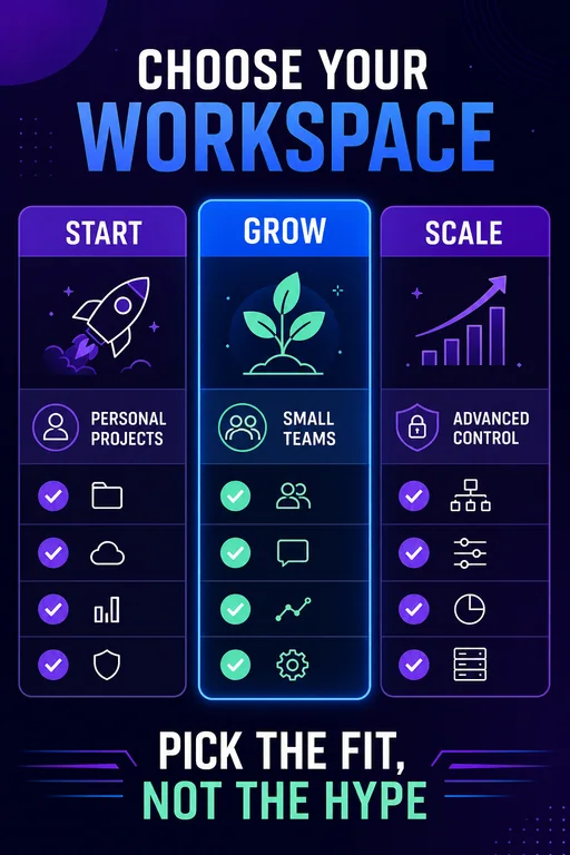
A clean three-tier product comparison emphasizing fit, capabilities, and a simple recommendation path.
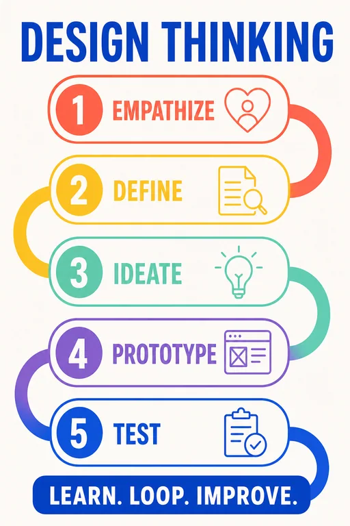
使用這個構想A five-stage process map with a looping visual flow and distinct activity cues for each phase.
使用這個構想A practical four-week onboarding roadmap with milestones, owners, and a welcoming visual tone.
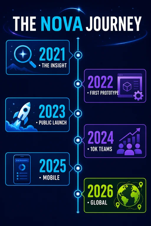
使用這個構想A milestone timeline showing a fictional product journey from insight to international launch.
使用這個構想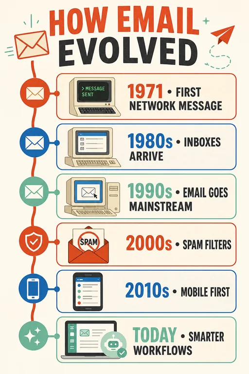
An educational technology timeline using familiar visual eras without relying on brand identities.
使用這個構想
A high-contrast list infographic with six practical security habits and clear protective iconography.
使用這個構想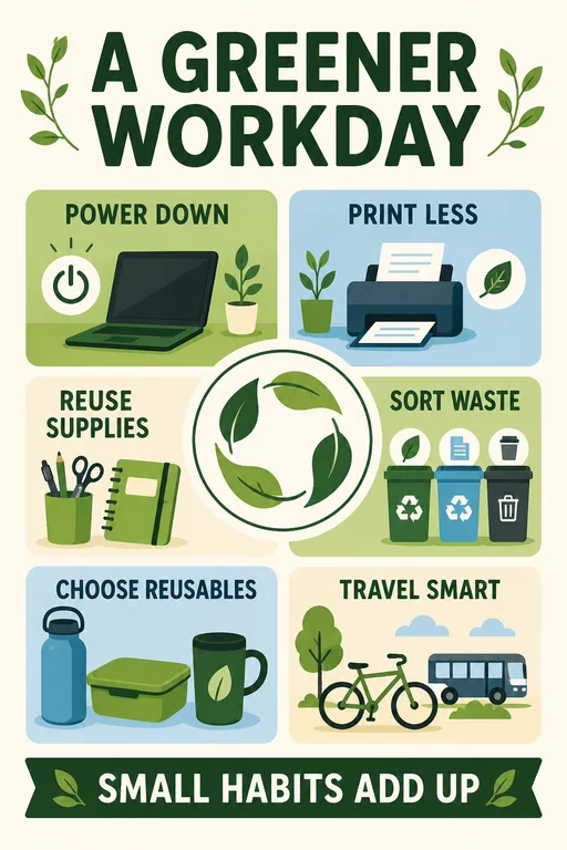
An approachable list of workplace sustainability actions arranged around a circular green motif.
使用這個構想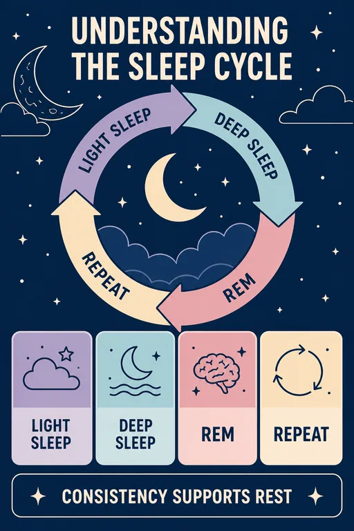
A calm educational diagram explaining the recurring stages of a typical sleep cycle without medical claims.
使用這個構想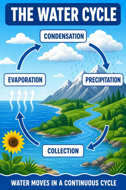
A classroom-ready illustrated cycle with four labeled stages and an immediately readable visual loop.
使用這個構想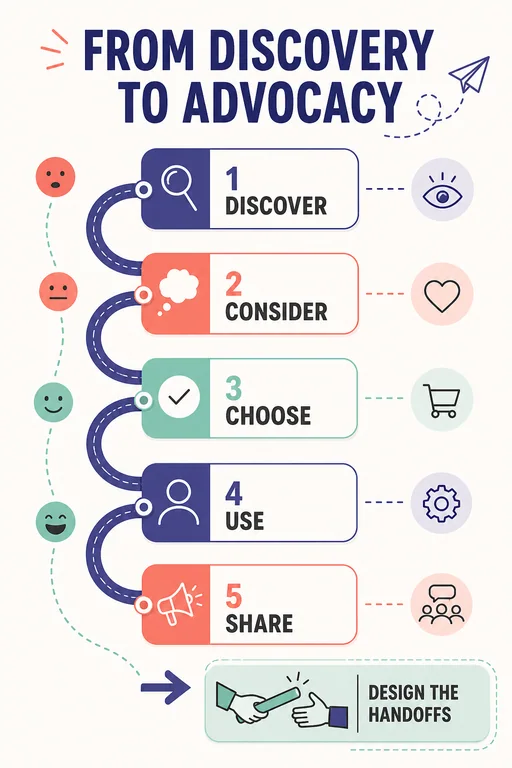
A five-stage customer journey with touchpoints, emotions, and opportunities kept visually concise.
使用這個構想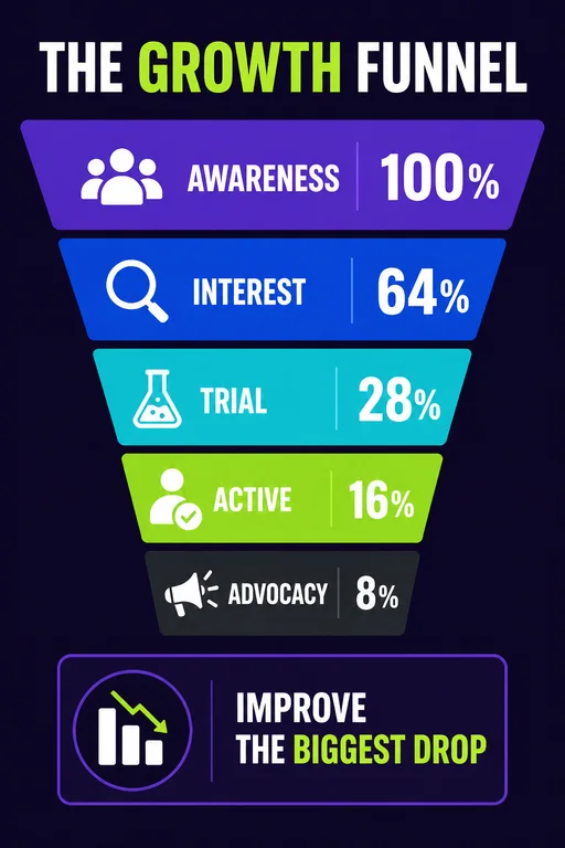
A clear acquisition-to-advocacy funnel with fictional sample conversion values and action cues.
使用這個構想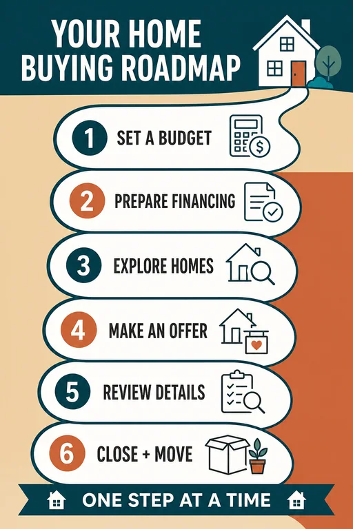
A reassuring step-by-step home buying guide with six milestones and no invented financial promises.
使用這個構想讓訊息清楚易懂
AI 資訊圖表產生器能將資訊轉化為包含標題、插圖與條理化區塊的視覺設計。Vismuse 會依據你的主題、事實與設計方向建立資訊圖表,並可透過聊天持續微調。
可以。貼上要呈現的重點,並說明受眾與目的。相較於只有寬泛的主題,條理分明的簡短筆記搭配一項主要結論,能提供更清楚的設計起點。
你可以探索統計摘要、比較圖、流程圖、時間軸、檢查清單與知識解說圖。請依事實之間的關係選擇結構,例如以時間軸呈現日期,或用流程圖展示依序進行的步驟。
可以。在提示詞中加入數值、單位、類別標籤與報告期間。要求 AI 僅使用這些數據,並加上所需的資料來源。分享前,請依原始資料核對呈現的數字與視覺比例。
以你提供的內容為唯一正確依據,並在產生前完成核對。AI 產生的資訊圖表是視覺初稿,請檢查用字、日期、數字與標籤。範例圖庫包含用於展示版面的虛構數據。
可以。透過聊天提出修改要求,例如縮短標題、更換配色、調整區塊順序或修正文字。產出結果是圖片,不會提供連結試算表的圖表,也不包含可個別編輯的圖表物件。
納入受眾、主要結論、確切內容、偏好的資訊圖表類型、版面與色彩。註明哪些文字與數值不得變更,並控制內容範圍,確保最終圖片清晰易讀。
可以。告訴 Vismuse 圖片的刊登位置,並要求合適的直式或橫式版面。使用精簡標籤、大型標題與充足間距,再以受眾實際觀看的尺寸檢查可讀性。
產生圖片會使用 Vismuse 點數。建立設計前,請查看應用程式中顯示的點數需求與目前的定價頁面。Vismuse 提供訂閱方案與單次購買。