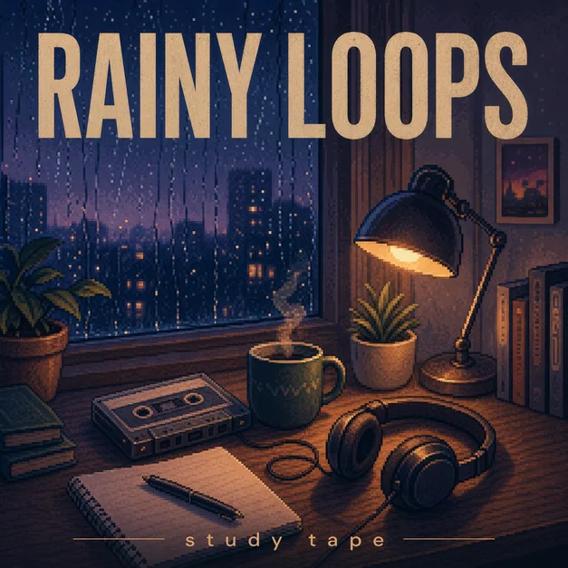
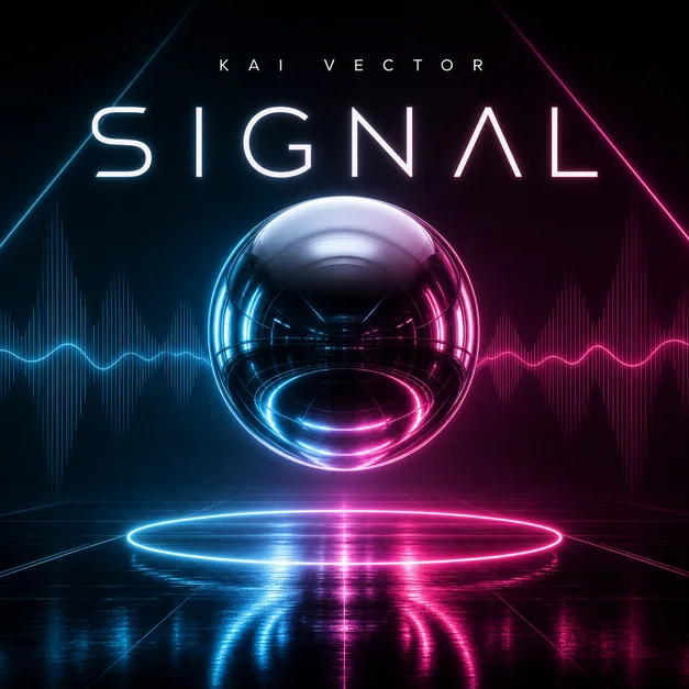
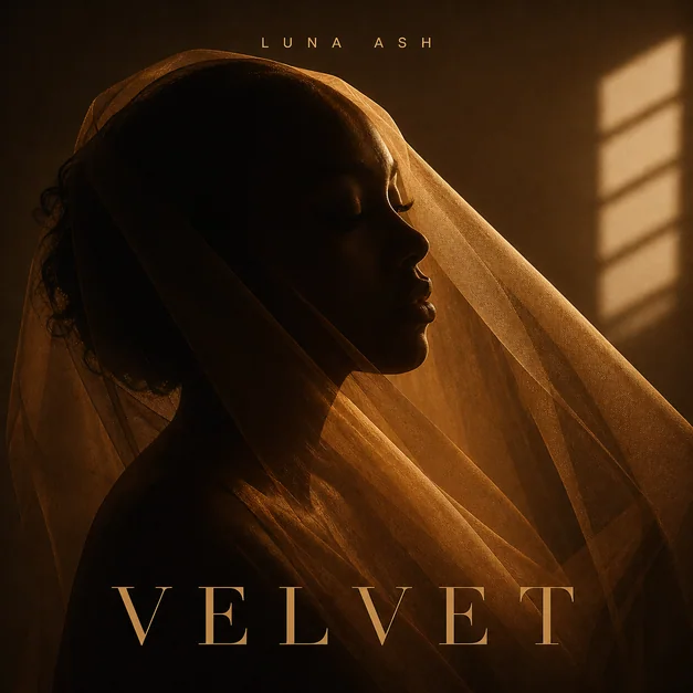
Start with a square canvas
Most album covers, single covers, mixtape covers, and playlist covers should be composed as a 1:1 square. A square canvas keeps the artwork consistent across streaming apps, profile previews, library grids, and social posts.
When generating with AI, ask for square album cover art or a 1:1 music cover layout so the subject, title, and artist name are not pushed into a poster-like crop.
- Use a 1:1 square composition
- Keep important details away from the edge
- Leave room for title and artist text
- Check the design at thumbnail size
Design for high resolution
A high-resolution square gives you room to crop, revise, and export without making the final artwork feel soft. Even if the cover will appear small in streaming apps, the source design should be clean and sharp.
Avoid tiny text, crowded decorative elements, and thin low-contrast typography. These usually disappear once the cover is shown in a small player or playlist grid.

Refine the crop before export
After generation, review the artwork as a full-size square and as a small thumbnail. The main subject, genre mood, title area, and color contrast should still be clear in both views.
If the image feels too busy, simplify the background, enlarge the subject, or move the text into a cleaner part of the composition.
Checklist
- Artwork uses a 1:1 square crop
- Title and artist text have enough contrast
- Important details are not too close to the edge
- The cover still reads as a small thumbnail
- The final image feels like music artwork, not a social poster
Reusable examples
Square cover size prompt
Use this when you want the AI to compose around a release-ready square format.
Create high-resolution square album cover art for a synth-pop single titled 'Glass Weather'. 1:1 cover layout, centered abstract glass subject, clean title area, strong contrast, readable small thumbnail, polished streaming artwork.
Frequently asked questions
Who is this guide for?
Album cover artwork should be built around a clean square format so it stays sharp on streaming platforms, social previews, and small thumbnails. The safest working format is a high-resolution 1:1 cover with readable title placement.
What workflow does this guide support?
This guide is designed to help with album cover size and connects to the matching Vismuse workflow page for hands-on execution.
Do I need design experience to use this workflow?
No. Start with the guide structure, add the details you already know, and use the matching Vismuse generator to create and refine the visual.