
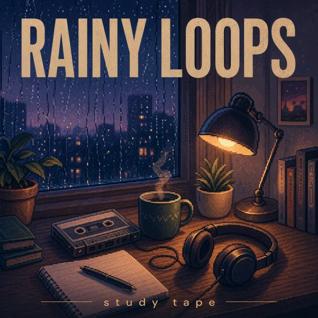
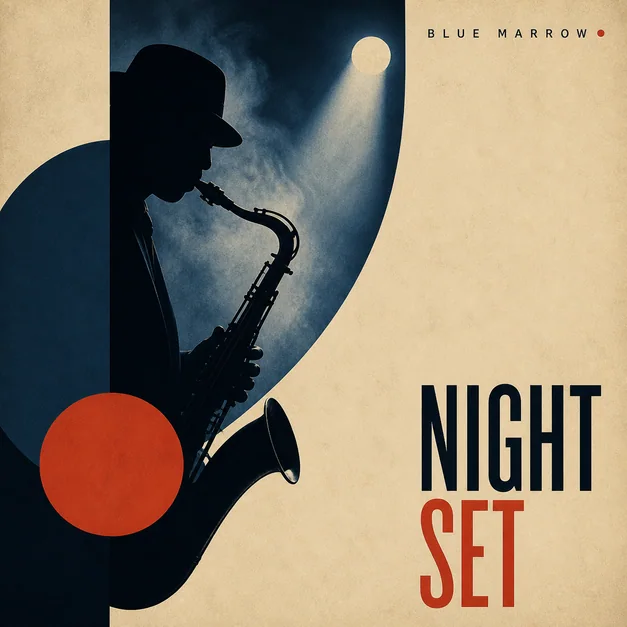
Use a square cover layout
For Spotify-facing artwork, start with a square album cover composition. The square format makes the cover easier to reuse across the release page, playlist art, social previews, and artist promo materials.
If you are using AI, include square cover art, streaming artwork, or Spotify-ready cover in the prompt so the first draft is framed around the final use.
Make the thumbnail readable
The biggest issue with Spotify album covers is not the canvas shape, it is readability at small sizes. High-detail backgrounds, thin text, and low-contrast title treatments can look fine large and vanish in a playlist grid.
Use a strong subject, clear color contrast, and a title area that does not fight the background. When in doubt, reduce detail and make the main idea easier to recognize.
- Strong central subject
- High contrast title area
- Simple background texture
- Readable title or intentional text-free design

Export after checking the edges
Before publishing, check whether any title, face, logo-style mark, or important symbol sits too close to the edge. Streaming UI crops and overlays can make edge details feel cramped.
Refine the artwork by asking for more negative space, a larger subject, or a simpler square composition if the first result feels too poster-like.
Checklist
- Cover is square and centered
- Main subject is recognizable in a playlist grid
- Typography has enough contrast
- Important details have safe spacing
- Artwork matches the genre and release mood
Reusable examples
Spotify-ready cover prompt
Use this for a clean cover that should work in small streaming surfaces.
Create Spotify-ready square album cover art for an electronic single titled 'Night Circuit'. Bold central light trail, dark background, cyan and red palette, clean sans-serif title area, readable thumbnail, polished streaming artwork.
Frequently asked questions
Who is this guide for?
Spotify cover art appears in many small surfaces, from album pages to now-playing views and playlist grids. Build the artwork as a clean square image and make sure the design still reads when it is reduced.
What workflow does this guide support?
This guide is designed to help with spotify album cover size and connects to the matching Vismuse workflow page for hands-on execution.
Do I need design experience to use this workflow?
No. Start with the guide structure, add the details you already know, and use the matching Vismuse generator to create and refine the visual.