
Album cover typography is not just a font choice. It decides what listeners notice first, how the release feels, and whether the title stays readable at thumbnail size. Start with hierarchy, then choose the lettering and placement that support it.
For the complete creation workflow, explore the album cover maker, including photo references, text revisions, and download options.
The quick answer
Strong cover text needs:
- One clear priorityChoose whether the release title, artist name, or image should lead.
- A type style that fitsDescribe the weight, shape, texture, and mood instead of naming a random font.
- Readable placementUse negative space and avoid covering the face or main visual detail.
- Thumbnail contrastThe important words should remain clear when the square cover becomes small.
Decide what text belongs on the cover
Most digital covers need no more than the artist name and release title. Add a volume number, featured artist, or advisory area only when it belongs to the release; move other credits to supporting artwork.
Text is optional. If the image already identifies the release, you can omit the title or artist name as a deliberate design choice.
- Write the final artist name and title exactly as they should appear
- Remove promotional copy, URLs, dates, and unnecessary credits
- Keep artist and title roles separate in the brief
Choose what the listener should read first
Good album cover typography has a clear hierarchy. Make the release title dominant when it carries the concept. Make the artist name dominant when recognition matters more. If the image is the main event, keep both lines quieter.
Use scale, weight, color, or spacing to separate their roles. Avoid making both lines equally loud; give the eye an obvious starting point.
Describe the type by its character
Ask for visual qualities such as bold, narrow, geometric, elegant, hand-drawn, distressed, or widely spaced. These descriptions connect the lettering to the music more clearly than asking for a generic “cool font.”
A named font may only be approximated in generated artwork. If the release depends on an exact licensed typeface or existing wordmark, use a traditional editor for that final production step.
Place the text where the artwork can support it
Place text in quiet space and keep important letters away from faces, busy textures, and the outer edge. If the background has no calm area, ask the agent to simplify it or add a subtle tonal field behind the words.
Check the cover at thumbnail size
Streaming covers are often seen as small squares. Zoom out until the artwork is roughly the size of a phone thumbnail; the main subject and title should still be easy to identify.
If the title disappears, simplify its treatment, increase contrast, reduce background detail, or give the lettering more space.
Describe a visual voice
Six useful album cover type directions
Use these as starting points, not fixed genre rules. The same type direction can feel different when you change its spacing, color, texture, and relationship to the image.
Bold geometric sans serif
Best for: Pop, electronic, hip-hop, and modern singles
Use heavy, clean letterforms, tight spacing, and one strong block of color.
Condensed uppercase
Best for: Rap, rock, cinematic, and high-energy releases
Use tall, narrow letters when the title needs impact without covering the whole image.
Refined serif
Best for: R&B, soul, jazz, classical, and reflective albums
Use elegant proportions, controlled contrast, and generous spacing for a quieter mood.
Hand-drawn lettering
Best for: Indie, folk, punk, and personal releases
Use imperfect strokes and restrained texture so the cover feels human rather than polished.
Minimal lowercase
Best for: Ambient, bedroom pop, lo-fi, and understated artwork
Use small clean type, wide spacing, and generous negative space around the words.
Type-led composition
Best for: Short titles, concept records, and covers without a portrait
Make the title the main visual form, then let color and texture support the letter shapes.
Work with the image
Where should the artist name and title go?
| Layout | Use it when | Prompt direction |
|---|---|---|
| Top and bottom split | A portrait or object occupies the center | Artist name small at the top; release title larger at the bottom |
| Lower third | The upper half contains the face or main scene | Title across the lower third with the artist name nearby but smaller |
| Centered title | Typography is the focal point | Large title in the center with minimal supporting text |
| Edge aligned | The artwork has strong negative space | Small text aligned to one clean edge with generous margins |
No canvas workflow
How to add text to an album cover in chat
In Vismuse, start with a complete instruction, then make one focused request at a time. The agent works from the current cover and preserves unmentioned details where possible, so you do not need to select a text layer or reopen a design editor.
Proofread after every edit. AI-generated lettering can still change a character, punctuation mark, or spacing detail. A focused request improves clarity, but it does not guarantee perfect text.
See hierarchy in context
Album title and artist name examples
These examples show how type can lead, support a portrait, or become part of the image. Open one as a starting direction, replace the text, and continue revising the cover in chat.
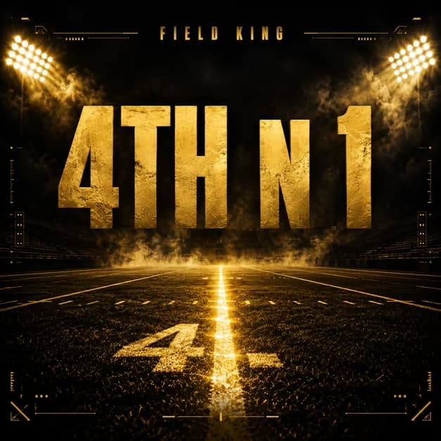
Fourth Down CoverA large central title that becomes the main graphic at thumbnail size.Open and revise in chat  Heartbreak R&BA softer serif treatment that supports the image instead of competing with it.Open and revise in chat
  Pop Punk BandHand-drawn title lettering paired with energetic flash photography.Open and revise in chat
  New Life ChapterRefined type, a short title, and generous negative space around a symbolic image.Open and revise in chat
 Troubleshooting
Fix common album cover text problems
| Problem | What to ask for next |
|---|---|
| A word is misspelled | Quote the full correct line and ask to replace only that text block. Proofread the new result again. |
| The title is hard to read | Increase contrast, simplify the area behind the title, or switch to a heavier and less decorative treatment. |
| Artist and title compete | Choose one primary line, then make the other smaller, lighter, or more widely spaced. |
| Text covers the face | Move the text into existing negative space or ask for more room around the subject before repositioning it. |
| The type feels generic | Describe the desired weight, width, texture, spacing, and mood instead of requesting a cool font. |
| A text edit changes the artwork | State the exact text change first, then list the portrait, background, colors, crop, and other details to preserve. |
Before release
Album cover typography checklist
- Artist name and release title match the final metadata
- Every letter, number, space, and punctuation mark is correct
- One element clearly leads the visual hierarchy
- The title remains readable as a small square thumbnail
- Text does not cover the face or another important detail
Frequently asked questions
Album cover typography FAQ
How do I add text to an album cover with AI?
Give the Vismuse AI agent the exact artist name and release title in quotation marks, identify the role of each line, and describe their size, style, color, and position. Review the result, then request focused text corrections in the same chat.
Should the artist name or album title be larger on cover art?
Make the title larger when it carries the release concept. Make the artist name larger when recognition is the priority. If the image should lead, keep both lines smaller. Make one element the obvious starting point.
What are the best fonts for album covers?
There is no single best font. Choose letterforms that fit the music and stay readable at thumbnail size: geometric sans serif for a modern feel, refined serif for elegance, condensed uppercase for impact, or hand-drawn lettering for a personal tone.
Does an album cover need the artist name and title?
Not always. Some covers rely on a recognizable image or established visual identity. Independent artists often benefit from including both, but either line can be omitted when the decision is intentional and the release remains easy to identify.
Can AI spell an album title correctly?
AI-generated text can still change letters, spacing, or punctuation. Put the exact wording in quotation marks, keep it short when possible, and proofread every result. If it is wrong, ask for a text-only correction while preserving the artwork.
Can I edit album cover typography without a design editor?
Yes. In Vismuse, you can ask the agent to correct, move, resize, restyle, or recolor text in the same chat. A traditional editor remains the better choice when you need an exact font file, kerning value, or pixel-level position.
Keep exploring
Related album cover resources
From title to finished cover
Add and refine your cover text with the AI agent
Start with the exact words, then adjust the hierarchy, style, and placement in chat.